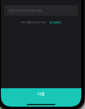
위와 같은 UI는 사용자 경험에 도움이 되기 때문에
많은 상용앱에서 볼수있다.
이는 아이폰에서도 x계열에서 특별한 처리가 필요한데
하단에 여백이 발생하기 때문이다.
어떻게 처리할수있는지 살펴보자.
개인적으로는 꽤나 시행착오를 걸쳤다.
키워드는 3가지이다.
1. KeyboardAvoidingView
2. SafeAreaView
3. react-native-iphone-x-helper
3번 라이브러리는 설치를 해주도록하자.
npm i react-native-iphone-x-helper --save
이제 구현을 할건데
KeyboardAvoidingView는 항상
제일 껍데기에 둔다고 생각하면 편하다.
Docs에서 보면
안드로이드와 ios에 동작 방식을 다루게 주기도 하는데
여기서는 동일하게 처리하도록 한다.
import { KeyboardAvoidingView, SafeAreaView, View, StatusBar, Platform } from 'react-native';
import { isIhponeX } from 'react-native-iphone-x-helper';
const statusBarHeight = StatusBar.currentHeight;
const isIphone = isIphoneX() && Platform.OS === 'ios';
const paddingBottom = isIphone ? 34 : 0;
const offset = isIphone ? -34 : statusBarHeight;
...
return (
<KeyboardAvoidingView
behavior='height'
style={{ flex: 1, backgroundColor: '#00cebe', paddingBottom }}
keyboardVerticalOffset={}
>
<SafeAreaView style={{ backgroundColor: '#000000' }}>
<View style={{ flex: 1 }}>
...
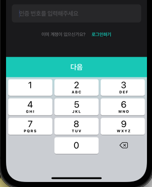
<CustomInput
keyboardType='number-pad'
placeholder='인증 코드를 입력해주세요'
/>
</View>
<CustomButton>다음</CustomButton>
</SafeAreaView>
</KeyboardAvoidingView>
)
input이나 button은 만들기 나름인데
버튼은 아래와 같이 만들었다.
const BottomButtonContainer = styled.TouchableWithoutFeedback`
  width: 100%;
  height: 56px;
`;

const BottomButtonWrapper = styled.View`
  width: 100%;
  height: 56px;

  align-items: center;
  justify-content: center;
  background-color: #00cebe;
`;

const BottomButtonText = styled.Text`
  color: white;
  text-align: center;
  font-size: 16px;
  line-height: 30px;
  font-weight: bold;
  letter-spacing: -0.48px;
`;

export const BottomButton = ({ name, onPress }: { name: string; onPress: Function | any; }) => (
  <BottomButtonContainer onPress={onPress}>
    <BottomButtonWrapper>
      <BottomButtonText>{name}</BottomButtonText>
    </BottomButtonWrapper>
  </BottomButtonContainer>
);
**************************
**** 21. 11. 30 업데이트 ****
**************************
문제상황
behavior를 height로 잡았더니
TextInput의 focus나 스크롤 위치 등
상황이 변화함에따라 버튼이
키보드 아래로 숨어버리거나
반만 보이거나 하는 등의 문제상황이 발견되었다.
따라서,
아래와 같이 수정하였으며
UX적인 측면에서 훌륭하게 동작함을 확인하였다.
// app.ts

import { StatusBar } from 'react-native';

... 생략
return (
  <>
    <StatusBar
      barStyle='light-content'
      backgroundColor: 'black'
    />
  </>
)
// auth.code.ts
import { KeyboardAvoidingView, SafeAreaView, View, StatusBar, Platform } from 'react-native';
import { isIhponeX, getStatusBarHeight } from 'react-native-iphone-x-helper';
...(생략)
const _inputValiation = ():boolean = () => {
let valid = true;
...(생략)
return valid;
}
const isIphonexStyle = isIhponeX() && Platform.OS === 'ios';
const statusBarHeight = isIphonexStyle ? getStatusBarHeight(true) +3 : StatusBar.currentHeight;
return (
<KeyboardAvoidingView
behavior={Platform.OS === 'ios' ? 'padding' : undefined}
style={{
flex: 1,
backgroundColor: _inputValiation() ? 'red' : 'gray',
marginTop: isIphonexStyle ? statusBarHeight : 0
}}
>
<SafeAreaView style={isIphonexStyle ? { backgroundColor: 'transparent' } : {}}>
<ScrollView style={{ flex: 1, backgroundColor: 'black' }} keyboardShouldPersistTaps='never'>
...(생략)
<CustomInput
keyboardType='number-pad'
placeholder='인증 코드를 입력해주세요'
/>
</ScrollView>
<CustomButton style={{ backgroundColor: _inputValiation() ? 'red' : 'gray' }}>다음</CustomButton>
</SafeAreaView>
</KeyboardAvoidingView>
)
핵심은 behavior 부분의 변화이다.
안드로이드에서는 AndroidManifest.xml에
...

<activity
  ...
  android:windowSoftInputMode="adjustResize" <-- 여기
>
...
</activity>
위의 한줄만 있으면 keyboardavoidingview에서
따로 처리를 안해도 적절하게 동작한다.
따라서 android에서는 undefined를.
ios에서는 권장사양이자 적절하게 동작하는
padding으로 설정을 해주었다.
나머지는 약간의 트릭을 통해
버튼이나 배경색 등을 컨트롤하는 부분이다.
'개발, 코딩 > App - React Native' 카테고리의 다른 글
| react-native-reanimated, Height 조정하기 (0) | 2021.11.24 |
|---|---|
| react-native-reanimated 에러 모음 (0) | 2021.11.24 |
| React Native, Gif이미지 사용하기 (0) | 2021.11.19 |
| react-navigation, white flickering when transitioning to the new screen (0) | 2021.11.17 |
| [RNFB] Android push notification not working on quit stats (0) | 2021.11.17 |